DOPPLE
-
Ten week project
-
Justin Yang, Andrew Christensen, Esther Sohn, Renee Chien
-
Team members worked in both roles
Overview
We chose this project because as students who came to UW in the midst of COVID we struggled to find a community or people to share our interests with, and while COVID definitely exacerbated the isolation.
Dopple was conceptualized in an upper level user centered design course in spring 2021, it was a collaborative effort between Andrew Christensen, Esther Sohn, Renee Chien, and Justin Yang.
This was created as a directory to find and start interest communities, designed by students and for students. We hope to guide users to online and in-person communities through centralizing information on what and where things are taking place, and democratizing that information-sharing.
The Problem
A lot of people may know what they are interested in but do not know how to go about exploring those interests or are too scared to. We want to assist the users in exploring their interests so that they will also be able to find a good community that will continue on with them in life.
Problem Statement
How might we grow college students’ (ages 18-24) connections to their interests, and through this experience, empower and enable them to find a like-minded community?
User Research
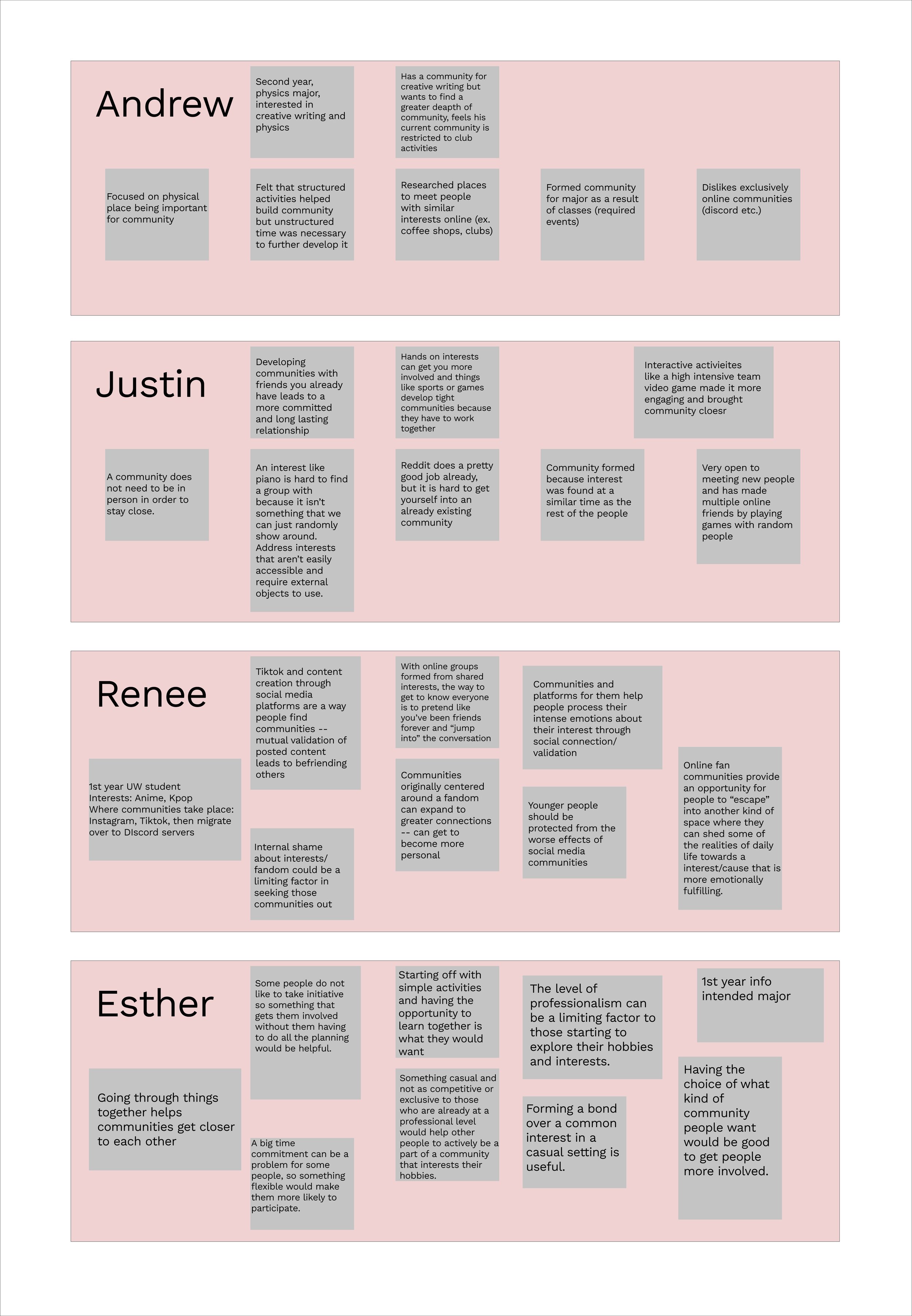
We began our process by interviewing people who fit our target demographic about communities and their experience building them. Our interviewees were within the range of 18-24 and were all college students. We then synthesized our interviews into a few key points which we used to focus our design process. Interviewees were also used to help develop personas that we would later use in other research steps.
We learned that users have different preferences for in person vs virtual communities. Some users feel barred from communities due to a lack of experience or knowledge. Having a designated space or platform can be helpful in creating a lasting community. Just because a relationship is online does not mean it is not as meaningful as an in-person one.
User Personas
Since the demographic that we were trying to target were college students, we created two user personas that had different personalities and interests based on our synthesized information from the interviews. One persona for Alice Dixon, a freshman that is double majoring in informatics and communications and the other for Thomas Choi, a junior majoring in physics. Using these, we created a journey map to see observe a typical day of someone who may use our app.
People may have interests or hobbies they feel uncomfortable sharing with people who do not share that interest. Some people have niche hobbies that they may struggle to find others to share it with.
User Journey Map
From the Thomas Choi persona we generated, we constructed a user journey map that followed our persona subject through their day, noting specific pain points that presented opportunities for our design, such as when Thomas experiences moments of loneliness or when cravings for recognition arise. Observing these emotions, we were then able to start formulating design requirements and goals for our application.
Design Requirements and Goals
Requirements
1. Suggest communities/events for users based on their selected interests
2. Enable direct one-on-one communication between users
3. Help users find both communities and events, in-person and virtual
4. Let users create their own events/communities for interests that are not listed
5. Encourage small-scale event posts and engagement
6. Enable users to generate share links to posts/events/communities/pages
7. Enable communities and people to easily move interactions offline
8. Allow users to showcase interests on their profiles
9. Allow users to search up and join communities that they want to
10. Allow users to easily edit their interests as they develop
Goals
1. Serve as an one-stop platform for finding/creating interest communities
2. Prioritize moving user interaction off of the platform
3. Provide users with affordances to easily move from Dopple to other applications
Storyboards
We each created storyboards based on our personas/user journey map to model potential user interactions with our product, this allowed us to plan out specific problems/situations we wanted our app to address. We were able to narrow down the focus of the app and started to brainstorm what features would be needed. Users would use our apps out of particular frustrations around community-building, such as being beginners in their hobby space or not being able to find people with similar interests. Users would approach community-building in different ways, such as by creating new communities or connecting with existing ones.
Information Architecture
To plan out our design, we mapped out the structure in an information architecture diagram. This allowed us to see how features we envisioned would fit together. This was used when mapping out and connecting screens in our low fidelity prototype as a guideline .This allowed us to better plan out the user flow and gain a better understanding of our overall page heirarchy.
Low Fidelity Prototype
Using our storyboards and other planning work we created a low fidelity prototype to give a framework for the app and roughly model a few key interactions within it, specifically the community/post creation. We used this to test out how our task flows worked before stylizing and polishing the prototype.
Usability Testing
We had participants from outside the design space interact with our prototype to quickly evaluate the strengths and weaknesses of our low fidelity task flows to give insight into what changes needed to be made as we moved forward into the high fidelity prototype.
Some key takeaways that we found are…
We learned that our bottom navigation bar fit all of our subjects pre-existing mental models.
Users wanted a back button as pages were difficult to navigate and it felt too linear (felt like a straight line).
The location of a post was difficult to find after posting.
Our full research findings can be found HERE
Annotated Wireframes
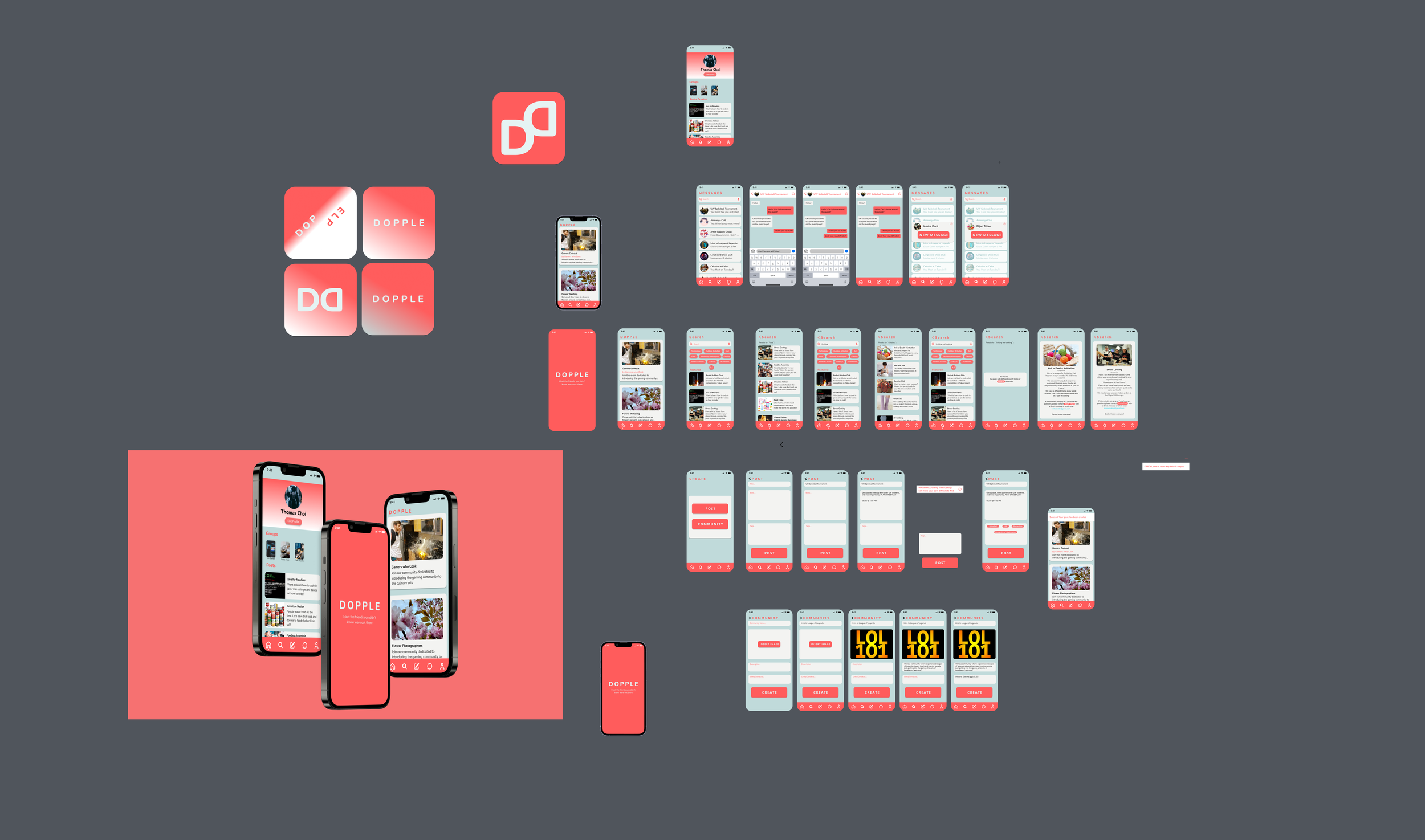
Using the low fidelity prototype, we created a wireframe that showcased all of our pages and features that were relevant to our community building application, which helped us start on the high fidelity prototype. With this we were able to define exactly what the primary goal of each page was so that we could better design them for that purpose. We also better understood how users may interact with key features on each page. The full annotated wireframes can be found HERE.
High Fidelity Prototype
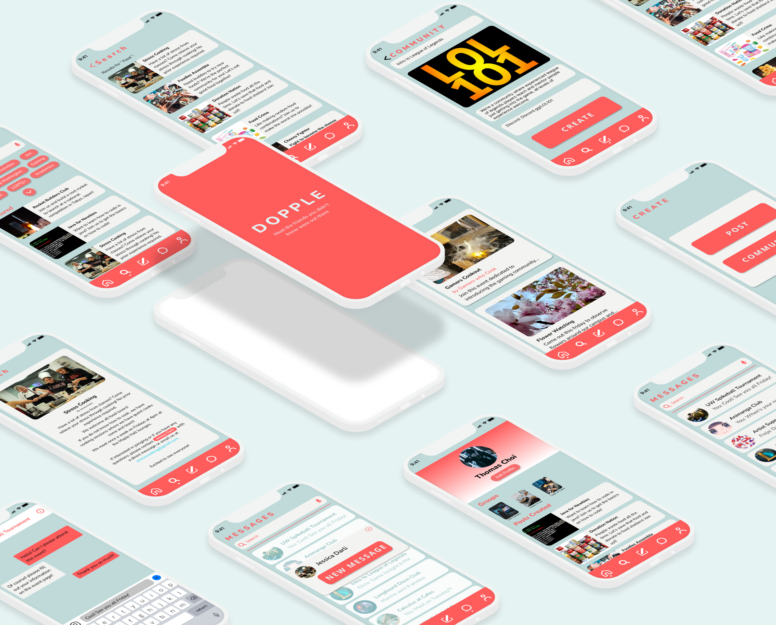
Using information from our usability tests we improved on the low fidelity prototypes user flows, stylized the interface, and added more realistic filler text and images to give a sense for what the complete app would look like. Deciding on the color scheme and typography for the prototype gave us the opportunity to create a platform that was complete and professional. Working on the different design aspects made us more inclined to focus on the details and refined our skills in looking at the overall interface.


