Rebuilding Together Seattle
-
Visual design class project
-
-
-
Client Research
Our client is Rebuilding Together, specifically the Seattle branch. The Seattle branch is one of over 150 Rebuilding Together branches across the country. What makes them stand out is that they are the only nonprofit that offers house repairs for no charge and are more focused on critical repairs instead of adding new structures to homes. Their purpose is to make communities safer by revitalizing them and rebuilding homes so that community members have a long-term place to age.
Their primary audience is essentially the local community. They are trying to get people to help their cause. I feel as if their website is almost like a recruitment and is trying to target middle aged adults to rebuild their communities. Their secondary target is people who need their homes to be rebuilt as they have a whole page to apply to get their house worked on.
Keywords that describe Rebuilding Together’s feelings are environmental, revitalizing, organic, community, friendly, inviting, and hearty.
Current Brand
I would say that they are doing a mediocre job at reflecting their mission in the visual brand. One thing that I would say looks good is how the main focus is community and rebuilding houses, which is shown through the logo of the split green and white house. Their other point of focus is revitalization so I think green is a good color choice to give off that effect. Another thing that I like are three little highlights of the mission, vision, and who they serve. Those are elements of the organization that people want to know about and can help get to know the organization a little better even from a brief look.
A weakness that I see is that the areas that should be the main focal point besides the slideshow, are the mission statement, vision, and purpose. On the entire home page, it is there and visible so I don’t think they are doing a horrible job, but I think it would be much more effective if it was larger and was able to stand out more. As of right now, it kind of blends in with everything else, and almost just skimmed over it.
Personas
Low Fidelity Mobile Interface
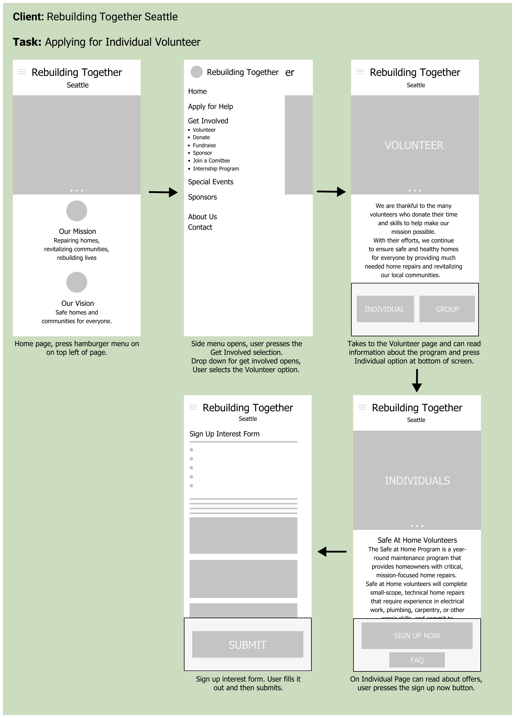
I chose to do the individual volunteer point for mobile using the iPhone 13 pro max as the frame size. I wanted to convey a feeling of simplicity and ease as the user navigated to the application page. Currently a lot of the text is really small and crammed together and there is a whole extra bar on the right side of the page with excess information on it. All they did was take their regular website and shrunk it down to fit a mobile size. The issue with this was that the text was really small and difficult to read and all of the tabs leading to different areas couldn't even fit on one line because there were so many. To accomplish this I incorporated a hamburger menu that contained all of the tabs and was easier to navigate. I also enlarged the text and centered for a minimal design and to relieve the page of feeling so crammed. This also hoped to help the symmetry and order of all of the information on the page. Within the drop down menu where volunteer was supposed to be found, it was at the very bottom so I simply moved it to the top to make it easier to find. I also used the Tahoma font because I found that sans-serifs were typically easier to read on a screen/online.
Currently the individual volunteer application page was hard to find as the website was bombarding you with information so by increasing the spacing between lines, upping the font, getting rid of the sidebar, and creating a burger menu, the page greeted you with a much more reasonable amount of information so the user is able to navigate more easily to the desired page.
Pain points
Pain Point One: Text Heavy
Solution: I increased the text size and got rid of the side bar that had excess information on it. I also tried to get rid of anything that did not contribute to the page the user was on.
Pain Point Two: Difficult to Navigate
Solution: Users are greeted with too many options and tabs as the current mobile site was just the desktop one but crammed down. I spaced everything out and added a hamburger menu in order for each page to look more modern and simple, while also making the navigation from page to page smoother.
Pain Point Three: Unprofessional visual
Solution: Currently, the menu bar does not fit all of the options on one line, ruining the symmetry. The layout and lack of type hierarchy made the pages look outdated. I increased the font and line spacing to make it more legible. I also tried to add more contrast so the hierarchy was more distinct.
Color Palette
The main colors for this brand are the two hues of green and white which have a cooler tone. The greens are used to highlight a sense of refreshment and invoke a feeling of revitalization.
A spring yellow is also used to contrast the greens with its warmer tone and to bring out a warm, inviting feeling with the outdoors in mind.
Logo
The main colors for this brand are the two hues of green and white which have a cooler tone. The greens are used to highlight a sense of refreshment and invoke a feeling of revitalization.
A spring yellow is also used to contrast the greens with its warmer tone and to bring out a warm, inviting feeling with the outdoors in mind.
Type Hierarchy
The Crimson Text type family is used mainly for the large headers with the organizations name. Its small serifs help convey a rustic and long time established feeling.
The Tahoma type family is used for smaller headers, paragraphs, and other details. This sans serif helps to make the body more clean and modern looking, while still not feeling to harsh on the eyes.
Imagery and Graphical Elements
The images used are ones that are already currently on their website. They are mainly of the community members volunteering together, which helps emphasize a communal feeling and make the user feel more invited.
For the graphic elements, my buttons, menu, as well as my icons were all round edged to give a more welcome and natural feeling. Green was used to further enhance the feeling of revitalization, and emphasizes certain points such as the current carousel page, as well as if a button should be pressed.
Redefined Mobile Flow
Reflection
This was my first time working with visual design concepts such as color theory and type hierarchy. Overall this project has taught me a lot about what goes into visual design and the necessity of considering factors such as grids and white space.
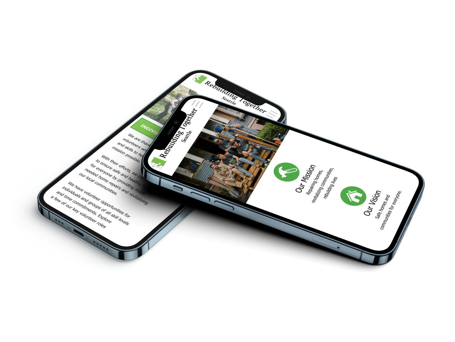
While Rebuilding Together Seattle is a pretty established organization, they did have some issues pertaining their mobile interface. Through this project I was able to revamp their mobile website to make it more visually presentable and modern. Now, instead of just shrinking down their desktop website onto a mobile screen, they have their own designated look for mobile now. Not only is the site now easier to navigate, but can appeal to a wider audience as well.


